My Love of Letterpress: City Branding Process
I absolutely loved the process of creating my city branding project for The Gallery Arts District. So much behind the scenes work went in to this project, from visiting a letterpress studio to create some typographical assets to designing fun t-shirts, totes, and branded swag. When a project includes this much process work, half the fun is sharing that process with others. The project prompt was to create a visually interesting logomark out of three typographical elements: one letter, one number, and one punctuation mark, all of which were assigned to us. Our tasks from there were to ideate a fictional brand that our logomark represented and create a graphic standards guide featuring illustrations, photography, logo guidelines, and applications for our selected brand.
Getting My Hands Dirty
The first step was to print our typographical elements. My assigned characters were the letter g, the number 2, and a colon. We spent a day at Central Print, a letterpress studio in St. Louis with a variety of vintage metal and wood type. I printed a series of characters that I thought would make interesting assets for creating my logomark. I then digitally isolated each character so I could examine them more carefully
A Logo is Born
My next step after isolating all my letterpress prints was to select the characters I liked best and to start experimenting with arranging them together. I created several iterations of potential logomarks in both black and white and color. I was especially drawn to variations where I reversed out one of the characters, creating negative space and new shapes to experiment with. I finally arrived on a version of the logomark with the two reversed out. I was drawn to the gently curving shape the two created and the dynamic diagonal orientation.
Setting the Tone
After I determined my logo and name, I began searching for inspiration for the look and feel of my brand and also wrote a brand description that more thoroughly described The Gallery Arts District. Given that I envisioned The Gallery in a metropolitan city, I curated some city stock photography with the hip, modern edge I was looking for. The images I was consistently drawn to were nighttime photographs of a city at night, alive with neon lights and pedestrians. My final color palette is inspired by these neon lights against the backdrop of a dark navy sky.
Illustration
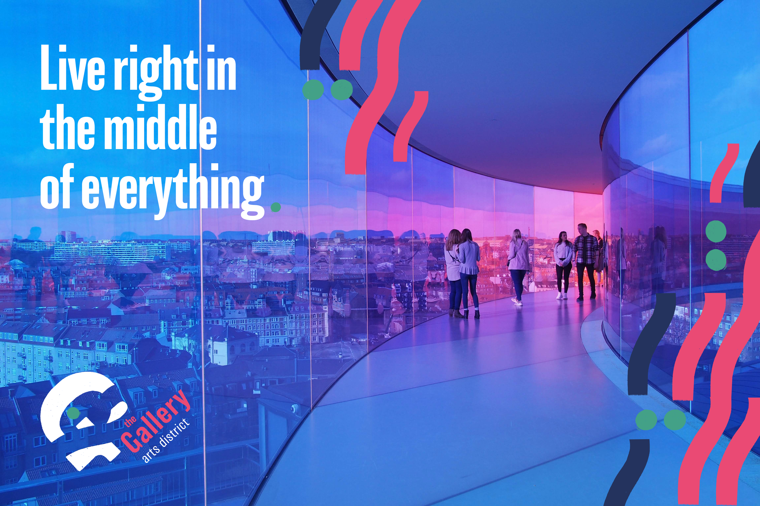
To further develop the intersection concept and the idea of The Gallery being a neighborhood that brings people of all walks of life together through the common bond of art, I decided to create graphic illustrations that look like parallel streets intersections from above. I created these icons by sectioning off pieces of the typographical characters I had letterpress printed and colorizing them. After exploring a series of iterations, I decided that the sets of parallel curving lines punctuated by the pairs of circles were the most visually interesting and conceptually relevant.
Bringing it All Together
With all of the parts in place, I created the graphic standards guide in booklet form to summarize all aspects of proper brand usage and to showcase all the vibrant brand applications available. My hope is that this guidebook will serve as a useful framework for any future work I produce with this brand. The result of this engaging project is a neighborhood where anyone would daydream about living.
Intersecting Ideas
Once I settled on a final logo, my mission was to decide what brand my logo best represented. The aspect of the logo I was most drawn to was the central area with the gentle white curve of the two intersecting the cross bar of the letter g. This intersection reminded me of the way highways and subdivisions appear in aerial photographs of cities. I looked at aerial photographs of large metropolitan cities for inspiration. Given this association, I decided that my logomark would represent a neighborhood within a large city. For instance, within St. Louis, smaller neighborhoods like The Loop and The Grove all have their own unique personalities and branding. Given my love of art museums and their importance in major cities, I decided that my neighborhood would be an eclectic, modern arts district called The Gallery.
“Situated prominently at the crossroads of the art museum district and downtown, The Gallery offers a unique opportunity to enjoy all that the city has to offer. Established in 1876, this beautiful neighborhood is bordered on all sides by five diverse art galleries and boasts a beautiful park and garden at its center for all to enjoy. Whether you make The Gallery your home or just visit for the day, you will find inspiration at every corner.”
Iterate, Iterate, Iterate
With the name, concept, logo, and color palette finalized, I created various iterations of the logomark to determine the most pleasing colorway and the ideal placement of the text relative to the icon. The final logo features the text oriented diagonally in what looks to be the path of the intersecting road, further supporting the concept of The Gallery being at the heart of the city.
Brand Applications
With the entire branding system in place, I began applying the brand in various contexts, including a poster series and branded merchandise. Given the vibrant color and imagery of the photographs I chose, I allowed the photograph to shine while enhancing the image with the illustrated icons and clean, modern typography. I kept the merchandise simple and focused on appealing to young, hip residents or tourists visiting The Gallery, who would likely gravitate towards a bold, graphic tee.


