
Summiting Logo Mountain: Process for Mountain Hardwear Rebrand
Given my love of the outdoors, my recent branding project in which I had the opportunity to rebrand Mountain Hardwear, an elite expedition and outdoor gear company, was one of my favorites. This project allowed me to do a deep dive into the history of mountaineering and the trailblazers who have left their mark on the industry throughout history. I found myself perusing detailed maps and photographs of some of the tallest mountains in the world, reading expedition logs from the most notable historic climbers, and daydreaming about my own next outdoor adventure. The goal of the assignment was to select a current retail brand that was in need of a visual and identity refresh. Given how much time I spend shopping for outdoor gear, selecting an outdoor brand for this project was a natural step.
Mountain Hardwear Research
I began this project with thorough research into the Mountain Hardwear brand, it’s values, and it’s history. Mountain Hardwear is an outdoor gear brand designed by a group of outdoor athletes who were frustrated by the way the outdoor industry in general was appealing to a wider audience in order to increase profits instead of staying true to their original base. However, more recently the brand has added non-technical products to its offerings, including graphic t-shirts, suggesting they were looking for a way to expand or reinvent their brand values and mission. Additionally, the brand’s current appearance, particularly it's bolt logo, might confuse new consumers given it’s resemblance to a hardware store or automotive brand.


An Adventurous Logo
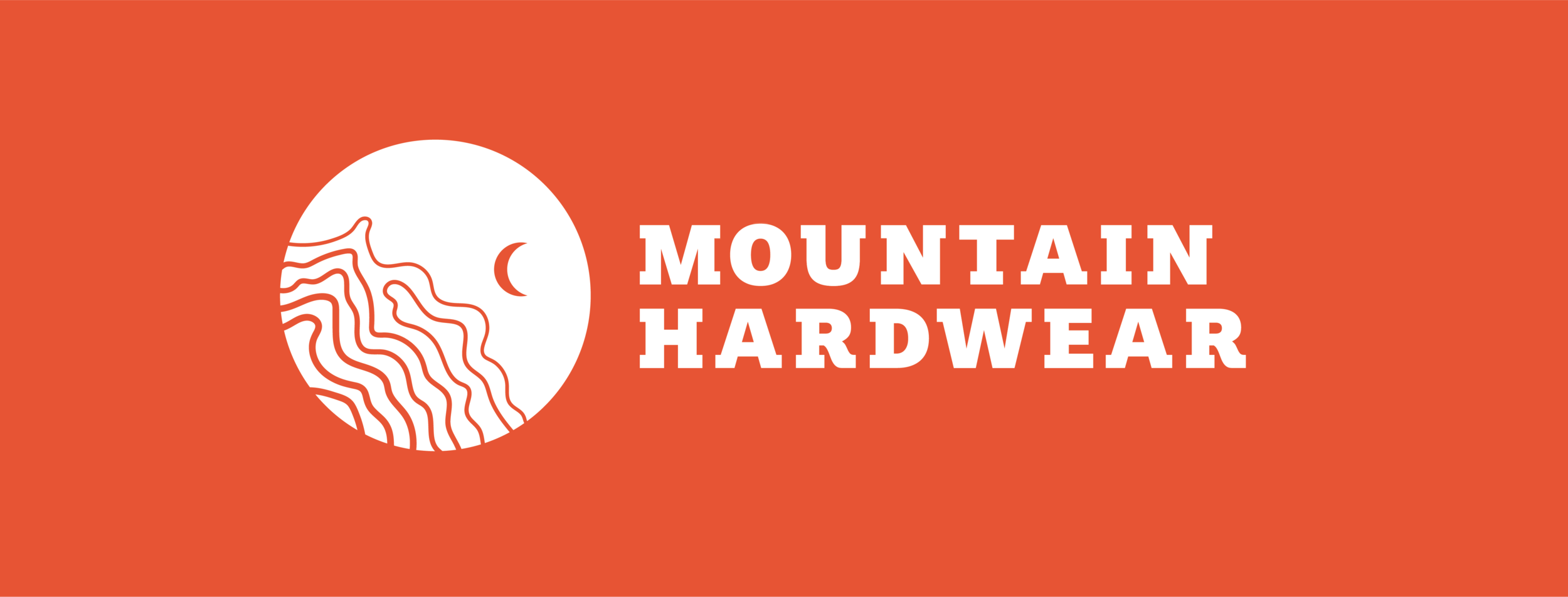
In creating a new logo for the brand, I wanted to create something that more directly referenced outdoor adventure than the current logo. In researching existing logos for outdoor brands, I found that the typical triangular mountain shape was quite overused. Thus, I began exploring more creative ways to convey the sense of a mountain. In looking at vintage trail maps, I found that many of them included shapes to depict different natural features, including triangles for trees, curving lines for rivers, and circles for points of interest or camps. To mimic these shapes, I created a set of linoleum prints and experimented with using these shapes as part of the logo.


I also examined topographical maps of mountains and was drawn to the flowing concentric lines that depict elevation. For my final logo, I utilized these lines masked inside a circle and added a small crescent moon to convey the sense of a vast mountain sky. The topographic lines are quite versatile in that they can reference either mountain elevation, flowing water, or other natural features.


An Illustrated Journey
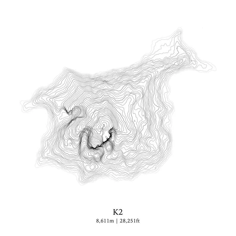
In creating additional graphic elements for the brand, I decided to continue with the theme of the topographic map lines. As opposed to generic lines that were just visually interesting but held no meaning, I decided to create topographic line illustrations that depicted several of the tallest mountains in the world, given that these are the places the Mountain Hardwear athlete aspires to go. For the color palette, I was inspired by the vibrant colors of the Mountain Hardwear gear itself. The vivid oranges, teals, and yellows create a nice contrast to the neutral backdrop of nature.


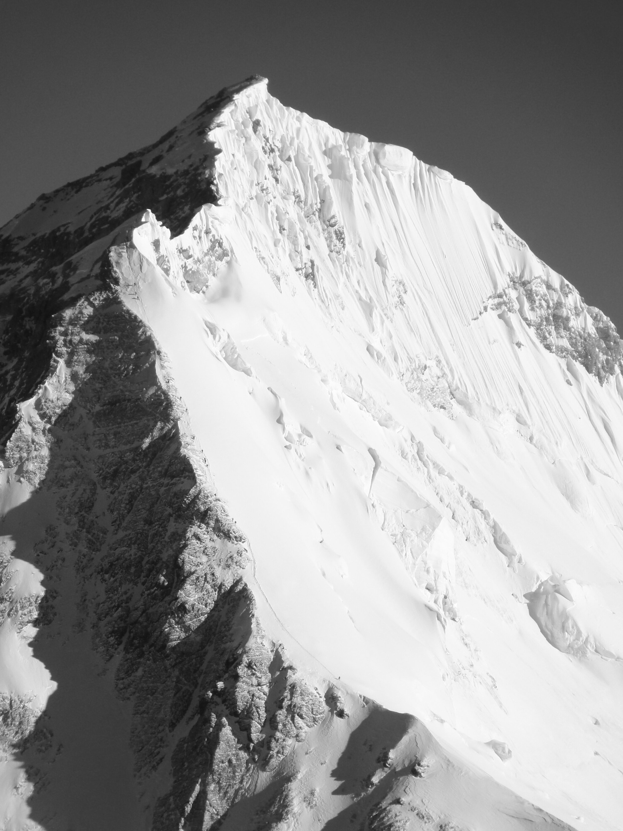
The “Faces” of Mountain Hardwear
To connect consumers to nature, I decided to rely on photography for many of the visuals in the brand. The photography I was drawn to depicted sheer mountain faces and peaks with white snowy or cloudy areas of the photo that could easily contain text or other graphic elements. As opposed to choosing more traditional lifestyle photography that features people more prominently, I wanted to allow the mountains to be at the center of the brand and to highlight the sheer size, majesty, and power of these epic peaks.


In addition to the photographs of the mountains, my research led me to many vintage photographs of some of the pioneers and trailblazers in the sport of mountaineering throughout history. I was attracted to the nostalgia of these images and loved that they provided a snapshot into history by showing the clothing and gear specific to that period of time. I especially was attracted to images of historic female mountaineers given that they are largely forgotten in such a male-dominated field. I thought that by featuring these barrier-breaking athletes, some of whom started climbing later in life or faced personal obstacles, aspiring athletes today would be inspired to start their own journeys.
Bringing it All Together
The end result of this rebrand is a new visual identity that features beautiful photography, graphic elements, geographic coordinates, and typography, layered and arranged with as much care and planning as an Everest expedition. I created a logo and graphic system that is fluid and can be used for a variety of different packaging, merchandise, and signage applications. Even though I’m no elite athlete, working on this project inspired me to plan my next outdoor adventure. Learning more about the amazing female athletes who pushed not only their own personal limits but pushed back against the barriers their male counterparts were putting up was also quite inspiring. To see my entire Mountain Hardwear rebrand project, just follow the link below. Happy adventuring!
